The importance of design in healthcare systems
The role of design in our everyday lives has taken a decisive turning point in recent years. Well designed experiences act as the bridge between consolidated infrastructures and new technological advancements, helping fill the gaps that these two can create inside human interactions.
Design allows us to accelerate and connect new ideas, products, and services in a more efficient way.
As a company we want to create products and services that don't merely help form and reform something that already exists, but also explore what happens next. A human-centered approach helps us create, reiterate and build solutions at a speed that wasn't conceivable before. Moreover, it helps our systems grow and become more efficient over time. And this is crucial, because it allows us to move faster.
Every single second of our customers counts. Sometimes one second can make the difference between life and death. Time represents the most valuable resource for us and for our customers.
Prescription and devices
Generally when people think about medical devices, they think about those devices that are used within a hospital setting. Those types of devices don't require a prescription, because you can't take them with you outside the hospital.
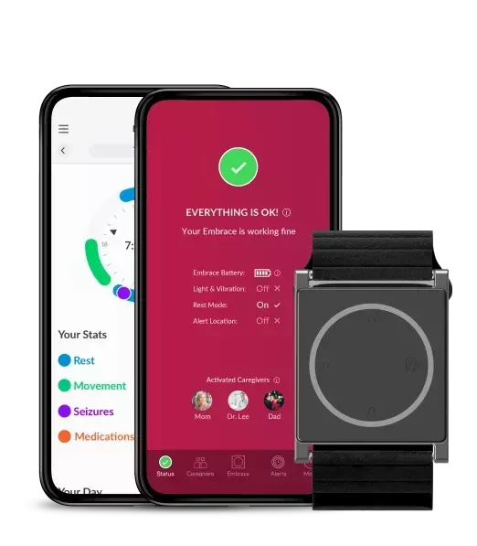
Embrace2 is a unique medical device because it extends beyond the clinic and into people's everyday life, providing more independence for patients and their family. Because it's used at home, and not supervised by a doctor, in the U.S. your physician must believe that Embrace will be useful for your seizure types, which is why a prescription is required before the product can be shipped.
When you go to the pharmacy to pick up your prescription meds, everything happens in person. We moved the entire experience online. The only in-person interaction is when the patient gets the prescription from their doctor. A critical responsibility that we must take is to verify the prescription as valid. We needed a tool that makes this process seamless and reliable.
Building an online form
Difficulties with forms are are not unique to the paper world.
Without forms, the digital world would just be a library. A room full of paper turned into a box full of data. Forms let us virtually comment, collect, book, buy, share and perform an infinite list of other actions. They enable us to do these things in a very different way from what our brains are naturally prone to, yet forms still represent a fundamental part of our digital environments.
Sadly these forms often deliver poor experiences.
Displaying content and explaining complexity in a beautiful way should never come at a price in terms of usability for any user. As designers and developers, our responsibility is to aid a fluid user experience for our audience across the website, app and product. In real life however, things are more complex. People experience tasks and features in a completely different way from one another.
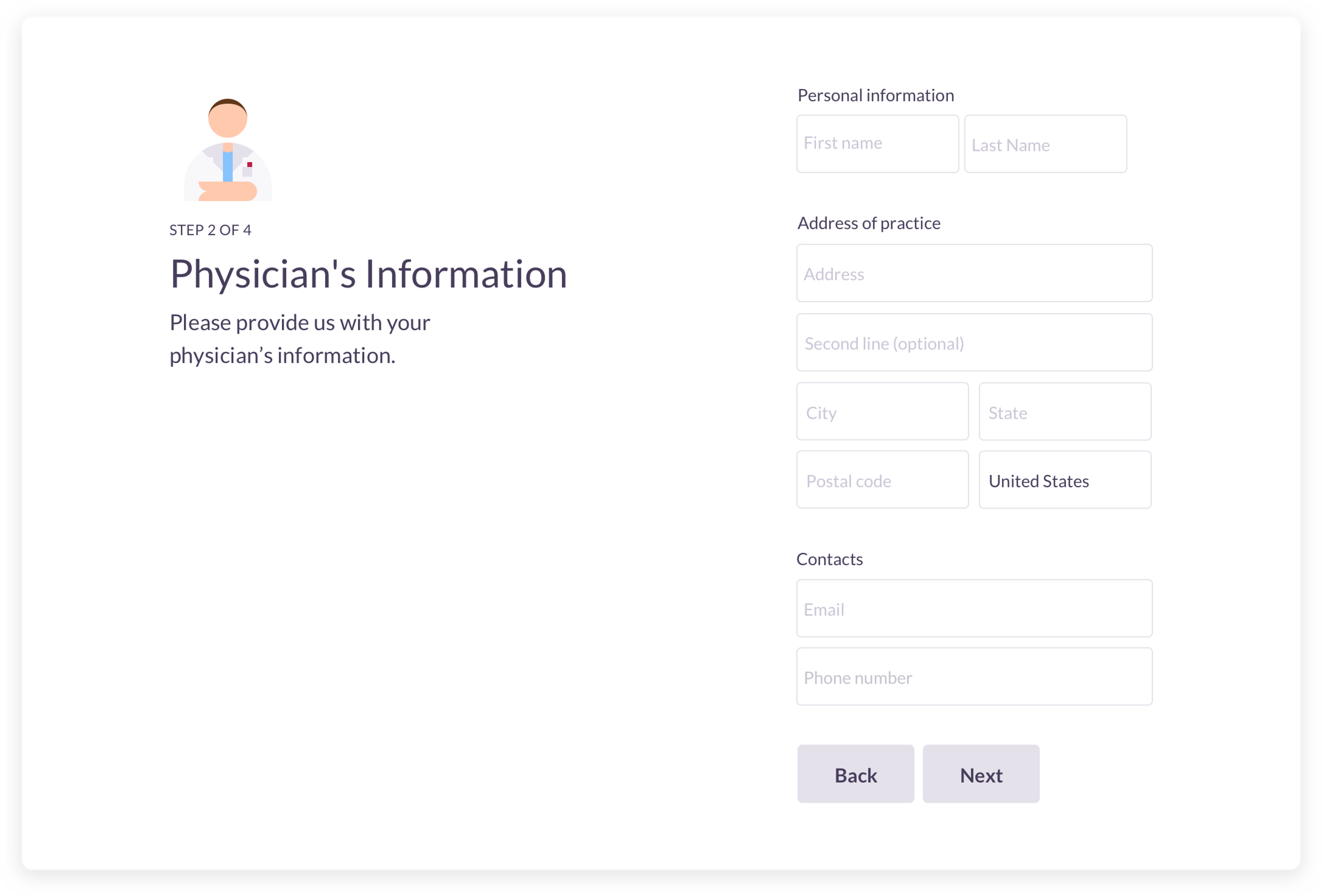
This was the beginning of our journey toward the first version of our prescription upload system. We started developing it in a way that it was easy for our U.S. customers to sign up, upload the prescription, and get their Embrace2 delivered. Through an easily accessible, mobile-to-desktop interface, customers are guided through step-by-step instructions to upload all the necessary information for their prescription to be safely validated.
Simplifying the process
Based on use data gathered from our prescription forms, our researchers reported about a particular user behavior, causing a lot of stagnation inside the prescription upload flow: the way customers inserted doctor information. Given the circumstances, we needed to define a more effective and much faster system to positively influence user behavior and guide them toward a successful upload.
One month after our first version of the prescription upload form was launched, we upgraded to something more efficient and reliable.
The National Provider Identifier (NPI) is a unique 10-digit identification number issued to health care providers in the United States by the Centers for Medicare and Medicaid Services (CMS). It's a powerful identifier that comes with the physician's name and address of practice.
We immediately investigated this solution. Two weeks later, after some fruitful discussion between product managers, designers and developers, a new upload system was in place: patients no longer needed to add the physician information manually. The only thing they now needed was a 10-digit number. The infrastructure behind the form would do the rest.
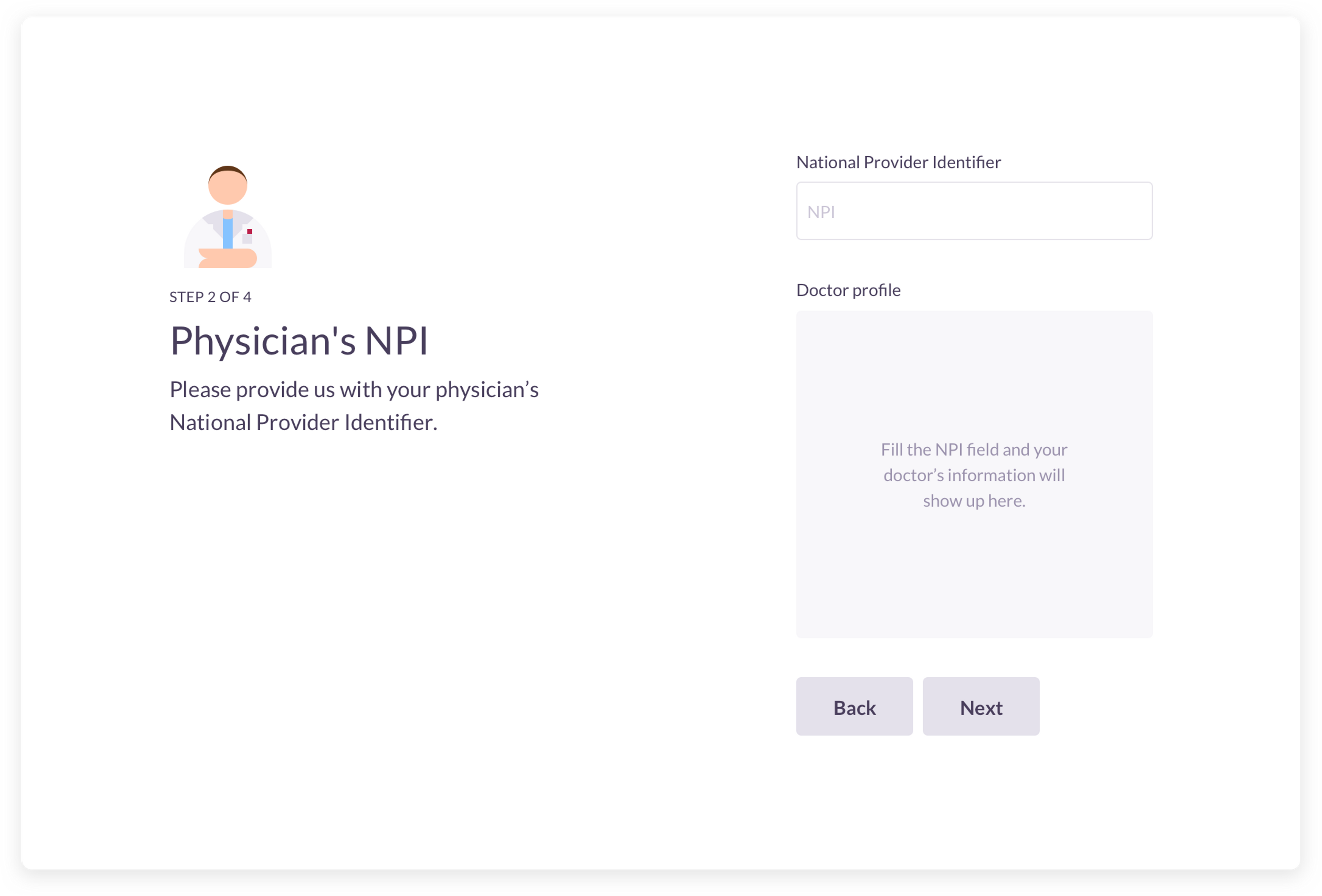
This automated process gives patients the opportunity to bypass the normal form process of including manually the practitioner info. Less time spent inside the form for our customers means quicker reviews for our specialists, and therefore faster deliveries.
Once a customer inputs all the requirements, valid prescriptions are verified, enabling us to unlock the shipment of Embrace to their State of residence.
Faster validations
The number of customers successfully managing to bring the process to the end, getting the prescription verified and Embrace2 delivered, have doubled on the first month from the launch of the NPI integration. Most important, our customers saved precious time, avoiding possible confusion and errors.
As a design-driven company we strongly believe that when a customer has to face any process, it should be simple. This means reducing everything to its essential components. Filling out a healthcare form should feel as natural as writing a note inside an agenda.
This calls for a deeper involvement to create healthcare systems driven by innovative, patient-centered design. Our goal is to make healthcare collaborative and aspirational, something you seek out and engage with, allowing you to be more self-reliant and take greater autonomy in your care.
